
Abstract Art Analysis 4: Generative Art Edition
Discover various forms of generative art and get insights directly from the creators.

Welcome to another week of AAA!
One of my favorite forms of digital art, and something I’ve started exploring in my own practice, is code-based generative art.
This week I spoke to some of my favorite generative artists for some insights into their work. Before speaking with them, I provided my own thoughts and analysis, as usual. You’ll see what they had to say about the work at the end of each analysis.
I get a lot of enjoyment out of experiencing a piece before I know anything about it. Then, after spending time forming my own thoughts, I like to learn more about the piece and compare my interpretation to what the artist intended. Sometimes our views are surprisingly close and sometimes they are very different. That’s just another fun aspect of abstract art.
Content:
Art:
‘Sol #33’ by Pixel Symphony
‘2 Shapes #87’ by Anna Beller
‘Pianist #40’ by Uinges
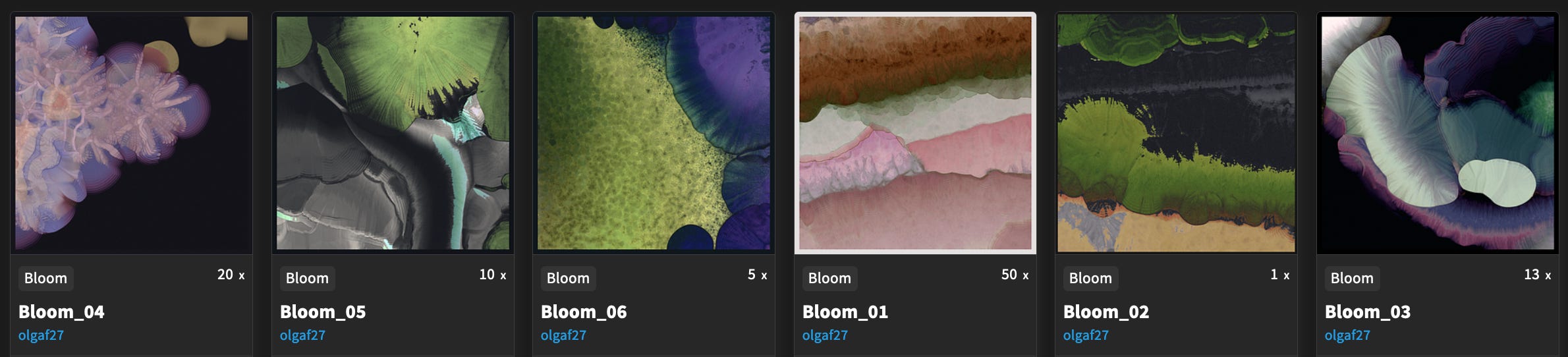
‘Bloom_06’ by Olga Fradina
‘Stars in the night sky’ by Daniel Oropeza
‘Ornithopter’ by pixelwank
‘Udnē #37’ by DistCollective
Extras: Updates on fxhash and links to the best generative art platforms.
You’ll find links to the piece at the end of each analysis. Enjoy!
‘Sol #33’ by Pixel Symphony
First impression:
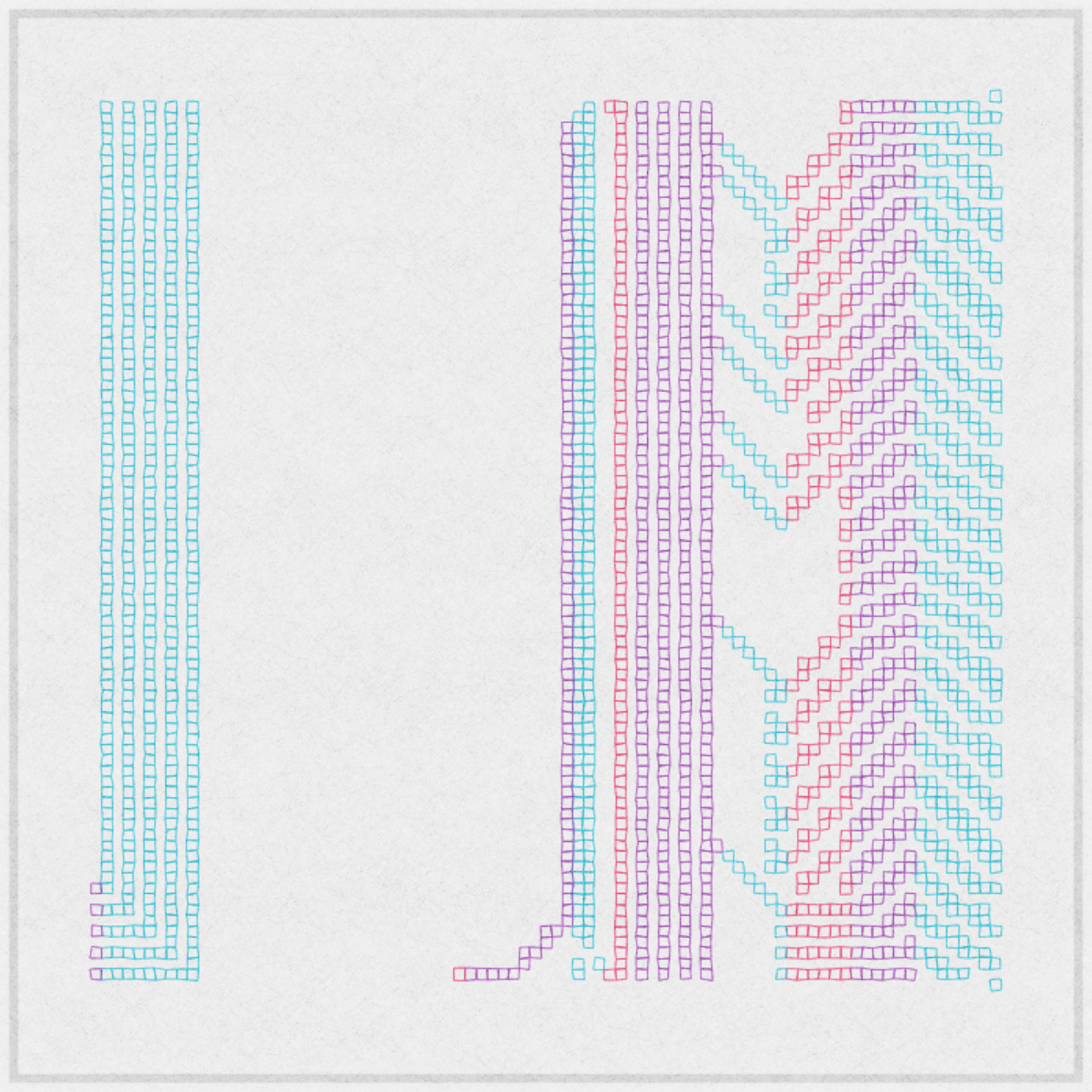
This iteration from the collection stood out to me as one of the most visually pleasing. Often, it’s the brightest colored, or the most complex ones, that catch the eye, but this one had the opposite effect in that its design and color palette gave me a calm feeling. Maybe it’s just the effect I need right now. Another thing that contributes to this softness, and something I find really fascinating, is the unevenness of the individual squares used to build the piece. You can imagine how much more harsh, and less interesting, the piece would be if all of the squares had perfectly straight lines. This is a small detail that goes a long way.
Something I absolutely love about this iteration is the five purple squares and the single red one pointed out here. The purple ones are the only different color on that entire blue area on the left and acts as a little satellite motif that keeps the balance with the larger purple areas on the other side.
The single red square has the same feel. There is also a common gesture happening with the two of them as they have an elegant little turn to the left in a way that lets you know they are important but not dominant. These are the types of details that excite me.
The open space acts as a structural element on its own. It is not nothing. It’s something that actually, somehow, makes you look directly at the silence. It has its own character.
This is a general observation that there are three main pillars composed of the squares. Two are attached by thin, angled bridges and one is separated from the other two.
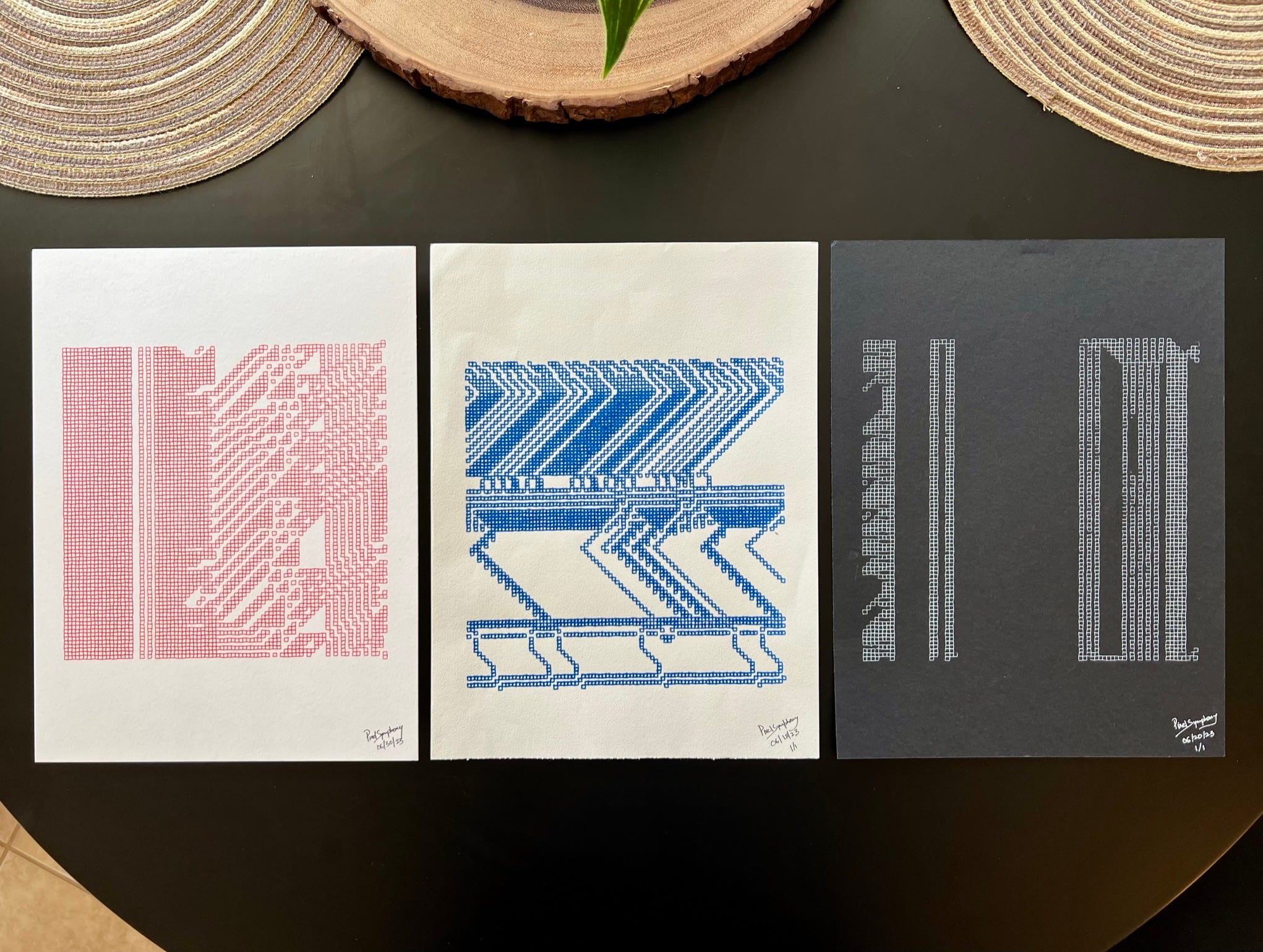
There was another cool feature to this collection on fxhash where you could redeem a physical print created by a plotter. I redeemed my mint (the red one) and PS was kind enough to send a couple bonus prints because he’s an incredibly kind human. Plotter prints of generative works have become a popular way to get high quality, real ink, physicals of digital pieces and I think we’ll continue seeing more of this as time goes on.
You can find a lot more examples of plotted generative art on #plottertwitter.
Artist’s comments:
“The inspiration behind the name 'Sol' springs from my visits to SF MoMA, where I always find myself in the space dedicated to the Conceptual and Minimalist artist Sol LeWitt. Through the repetition and variation of a singular concept, LeWitt constructed forms that were striking, often evolving from basic geometric forms into intricate structures. LeWitt's artistic philosophy centered on creating art guided by predetermined instructions or rules, emphasizing that the core idea transcends its physical execution. This marked departure from the traditional role of the artist's hand underscores LeWitt's reliance on conceptual directives rather than personal execution.
The series, Sol, is a homage to LeWitt's ingenuity in favoring dispassionate geometric forms over the emotionally-infused abstract art styles. This sentiment mirrors the principle of emergence in cellular automata, where complex systems arise from the interactions of simple components governed by rules. Sol uses cellular automata where the state of a cell in a new generation is determined based on its own and its neighbors' states in the previous generation. The guiding rules for these transitions, however, are not static; they undergo a random change every few generations, chosen from a possible 256 rules.
Incorporating slight positional shifts, hand-drawn textures, and outlines, I've introduced a touch of organic randomness to embrace the interplay of structure and spontaneity. The resonance with LeWitt's influence extends further, as Sol being a plotter project aligns with the artist's philosophy of adhering to conceptual guidelines instead of traditional manual crafting by hand.”
Collect or bid on the piece here.
Full collection here.
Follow the artist here.
‘Ornithopter’ by pixelwank

First impression:
I was instantly drawn to the action in this piece, as well as the softened primary colors, and brush-like texture. My first thought is that it looks like the flight of birds.
Upon further inspection, it appears to be composed of many straight lines that cross and create triangles in the process, which are then filled with color and textured afterward. I could be totally wrong, but I do love the consistency of triangular shapes here. Two of my favorite elements that keep me coming back are:
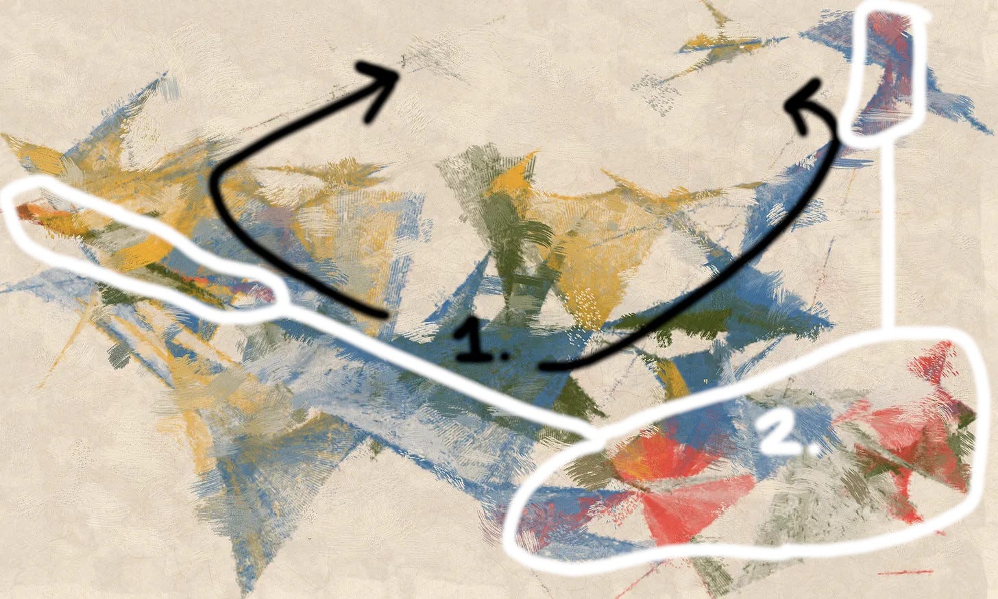
This is how my eye naturally moves, or tries to move, around the canvas. It feels like there’s a sort of oval-shaped whirlwind happening and this is a captured moment where most of the material has slowed toward the center but could break up at any moment.
The reds really stand out as a powerful element and I appreciate how they’re placement in three opposite areas.
Artist’s comments:
“Ornithopter is a nod to da Vinci's theories of flight. The odd form of the flying machine inviting the viewer to explore the piece and imagine how it all fits together. Trying to emulate a distressed brush texture, the roughness lends itself to the old worn parchment we'd find such designs on from that period.”
Collect or bid on the piece here.
Follow the artist here.
‘2 Shapes #87’ by Anna Beller
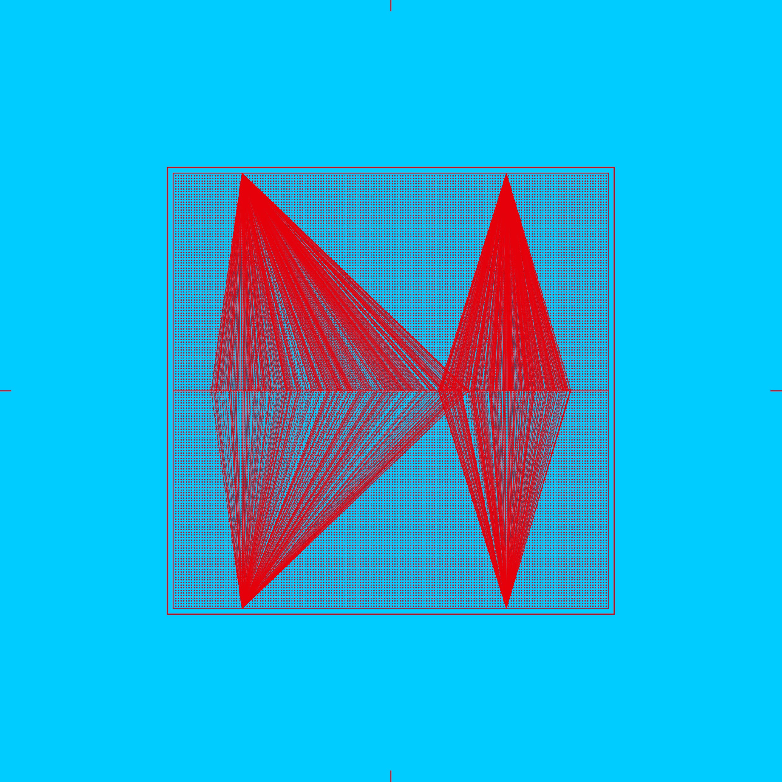
First impression:
This collection caught my eye very quickly and it wasn’t because of the bright colors in this specific piece. The first iteration I saw had a muted palette. It was the elegant use of minimal materials and the unique design of these materials that made me stop and want to see more. Then when I saw how it animates like lasers, it became even more interesting (links below).
As the title suggests, this is a story of two shapes and how they “dance” with each other in the confined space. In some pieces, the two objects overlap significantly; in others, they are almost the same size or vary greatly in size and position. What I liked about this one, aside from the colors, is how the two shapes are placed on both sides of the square and the way they are opposite in size. It gives the impression of two lovers facing each other and holding hands.
Another thing I find fascinating is the way that the two “shapes” are formed. They are not shapes in the traditional sense of having clearly drawn edges, then filled in with color. They are actually made up of many straight lines that each start from two opposite single points and spread out at different angles to meet in the middle, giving the impression of two objects. This added complexity enriches the simple design.
Artist’s comments:
Anna provided some points of focus for this collection, as well as in her broader work. It may be helpful to know that she has a background in architecture.
- 2 shapes interacting - thick, thin, defensive vs offensive
- Movement is important - like a dance
- Different expressions through simple means
- Playing within rules
“I work a lot with dualities in general. In this case, I’m using the mirroring effect to create the shapes themselves. The two individual shapes interact with each other.”
Collect or bid on the piece here.
Full collection here.
Follow the artist here.
‘Pianist #40’ by Uinges
First impression:
When I first saw this collection, my thought was that it felt musical, but maybe that it was just my musician-brain applying that filter. I also wondered if it was inspired by camera film. After reading about it and speaking with the artist (read artist’s notes below), it turns out this is inspired by the keys of a piano. In this piece from the collection, the general shape, colors, and white background stood out to me. Each of the lines are like independent melodies in counterpoint. If you look at a piano piece (or any score) by J.S. Bach, you’ll see how the different melody lines expand and contract throughout the work. You can see it even if you don’t know how to read music.
Uinges has done a great job at creating the essence of the physical instrument and the music played on it, all while being a wholly abstract piece that stands on its own without the knowledge of its inspiration.
This area of contraction adds a lot of tension, which really helps to give a sense of movement in the piece. I love the dramatic shift from the wider areas to the central area of tension and back out again. This adds drama and a bigger feeling of release when your eye travels upward or downward through that middle area and into the expanded areas.
The offset “keys” in most of the lines also add to the sense of movement. They also add complexity to the texture as they emphasize the rectangles against the smooth curvy lines. Finally, they allude to the different heights of the piano keys.
The blue line is the only one that does not have offset pieces as mentioned in ‘2.’. Its placement above the others, combined with its distinct color, emphasizes its importance. The blue and the pink lines are opposite in texture and they are the only two bright colors amongst black and white. These two are the main melodic elements meant to capture your attention.
Artist’s comments:
“The pianist is a true story of a man who lives with his daughter and earns a living through performances in various cafes. Their income is average to low. In fact, I tried to show that when the pianist plays, the suspended piano keys represent the atmosphere of that space. The pianist is always sad. The notes come out of the piano sheet and fill the space with sorrow and joy. Instead of showing notes, displaying the piano keys was the best option to depict this atmosphere.”
When asked if this is a true story, Uinges said he plays piano and learned it from his father and that it is a true story that he wanted to depict. I think this is a beautiful way make art.
Collect or bid on the piece here.
Full collection here.
Follow the artist here.
‘Bloom_06’ by Olga Fradina
First impression:
My first thought was that this couldn’t possibly be a fully code-generated piece. The watercolor style and natural forms looked too organic. I’m very familiar with Olga’s work and a lot of it is inspired by forms in nature, but with a semi-educated eye, I can usually tell it is made from certain types of generative systems. Whether, or not, the techniques used here are obvious to some, I was blown away and totally in the dark on how this one was created. The colors and the specific design of this piece also made me wonder if it was inspired by plants in the ocean.
Considering this collection is titled “Bloom”, with every piece exhibiting a watercolor aesthetic, I assume the goal was to get a “watercolor bloom”, which is the irregular color texture you get when you add more paint or water to an area that is already wet. This is gorgeously done.
This piece is also a story of fractals. All shapes are similar and made up of uneven circles. You have large purple ones on the right (with small purple blooms on top of them), the smaller green variations that make up the whole left side, and the tiny dark ones along the edges of the purple.
The boldest elements of the composition lean towards the top right corner. This type of imbalance makes the piece feel alive, rather than sitting stagnantly. There’s the impression that the purple areas are slowly growing toward the middle of the canvas. The condensed darker green area on the left give a touch of balance on the opposite side.
Artist’s comments:
“This is a rather controversial collection for me. I thought for a long time whether to publish it or not. The fact is that I have a complex relationship with color. For me, this is a very important aspect of perception. If I am in a space in which the color scheme is not pleasant for me, I feel uncomfortable. I can't watch a movie that was filmed in a bad color scheme in my opinion. Color greatly affects the psycho-emotional state of a person. Perhaps for me it is expressed very sharply. I love monochrome muted colors.
In interior design, I started with rather emotional color schemes. But over time, having experimented with this, I came to a very restrained color scheme. Sometimes accentuating details with bright flashes of color. I always spend a lot of time choosing colors and materials. When making art, I begin experimenting with these. Striving within myself for monochrome, something pushes me to explore color and find harmony for myself with it. Every time I begin, I doubt whether or not I want to use it. It’s as if I do not feel that this fully corresponds to my statement. But in the end, I accept it as part of myself and try to find a balance.”
Collect or bid on the piece here.
Full collection here.
Follow the artist here.
‘Stars in the night sky’ by Daniel Oropeza
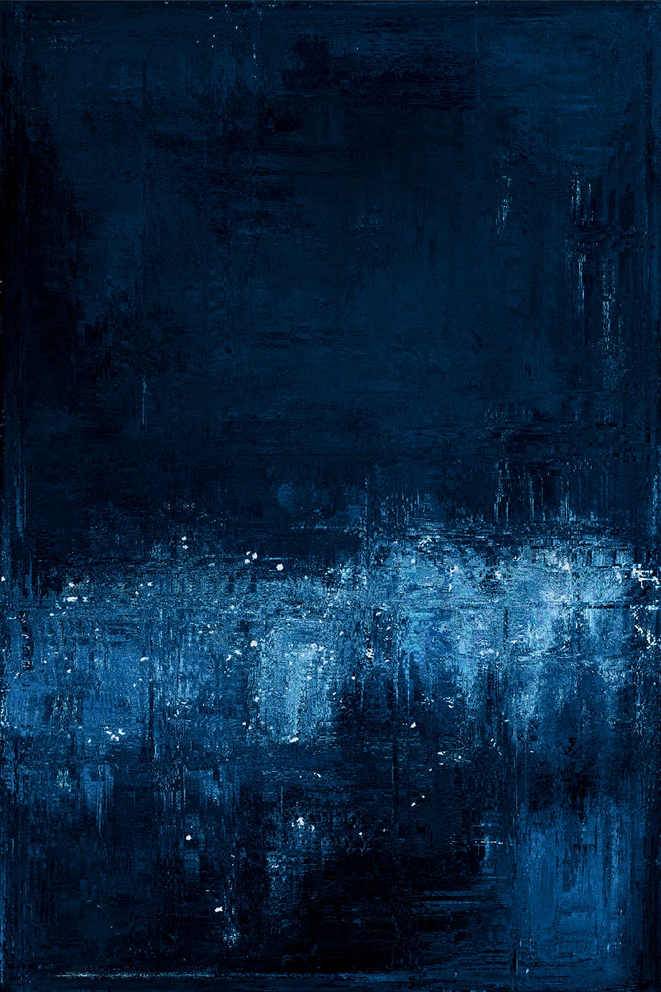
First impression:
As I said in a previous post of a piece from this collection, “I feel like this texturing would make any color combo look really good.” This piece is an example of opposite colors from the previous one and slightly different in composition. This one is dark and cool in temperature, and compared with the other work, in which I felt a sense of movement and violence, this one has a kindness about it. It feels still and quiet. The title really hits the nail on the head in describing the feel of this piece for me (I actually inadvertently ended up naming the piece when I commented on a previous post… an unexpected and exciting little collaboration with the artist).
I love the use of shading overall. The palette is predominantly blue, ranging from near-black to delicate shades blending with white. I really appreciate the balanced use of white specs at the very top of the canvas that is used just enough to keep every area of the work interesting instead of just fading to darkness in a large area. The white streaks in the right top half help here and tie in the thin, horizontal, line at the bottom. The light composition is a big part of the story here and it’s done brilliantly.
Artist’s comments:
“Each piece is built from layers and layers of texture and noise. Each texture layer is complemented by different modulation functions.
Some of the pieces are abstractions generated from a geometric element and others are inspired by nature. The mix of modulated layers and noise generates this diversity of abstractions.
"Light and Shadow" is nothing more than a constant exploration with light and darkness, with imagination and nature, with bright and opaque colors, with contrast and brightness.”
He provides another little insight in a post.
Collect or bid on the piece here.
Full collection here.
Follow the artist here.
‘Udnē #37’ by DistCollective
First impression:
This piece, and the whole collection, jumped out at me immediately as something totally different from anything I’d seen before. The form and detail here are exceptionally clean and meticulously crafted. If I’m relating it to the real world, I’m seeing stone, smoke and fire, sun rays, some kind of biological growth happening in the cracks. It feels alive and active, yet beautifully contained within a clear-cut border to let you know this is a completed piece of art. I highly recommend watching the way it animates on the collection page in the link below. The attention to detail by this artist duo is unmatched.
Looking a little closer, I notice two dimensions of balance here that I like. The main focus is the uneven horizontal line that splits the pieces in half with deep red and yellow condensed particles reminiscent of a disease, then there’s the vertical split on the left with straighter lines for contrast. You also see blurry, waterpaint-like, circles in the foreground on the bottom half and a faint version in the background on the top half. The prominent diagonal yellow area adds an angular element to predominantly square-centric design.
Artist’s comments:
“Udnē was part of a live minting experience powered by fxhash and the Tezos Foundation at Art Basel Miami Beach 2022. One of the main focuses of this event was to highlight how a long-form generative art project can produce a variety of iterations. Despite the high edition size, this was quite a challenge, but we enjoyed every moment of the creative process.
This project incorporates many techniques from our previous projects, like Mina, Refractions, and Deconstruction, using the particle system algorithm. We also added another texture layer, which we termed "watercolor." This texture contrasts with the particle systems. Using two contrasting textures provided us ample space to experiment with composition. There are over 50+ compositions, each with its own variations. Our approach to working with the particle system primarily focuses on combining three unsynchronized mathematical equations, which create different textural layers in a composition. Each iteration is essentially three basic particle systems that operate with distinct equations. When superimposed, they generate a myriad of beautiful textures. Adding the watercolor texture made the combinations even more intricate.
Additionally, apart from our iconic color palettes from previous collections, we developed new color palettes to amplify the variety in sceneries. We sought inspiration from everyday environments and places we've visited that left an impact on us, selecting colors that echoed these scenes.”
Collect or bid on the piece here.
Full collection here.
Follow the artist here.
Extras
Several of the collections I talked about in this post were minted on the fxhash generative art platform. Until now, they have always been the exclusive generative art platform on Tezos. They’ve always worked very hard to consistently update the site with new features.
Soon, fxhash will introduce the capability to mint on both Tezos and Ethereum. Additionally, artists will have the on-chain minting option for both blockchains. When you look at art on the platform, Tezos and Ethereum collections will be integrated, which will help dissolve perceptions of difference in quality of the art based on the blockchain it’s on. There are many other features in the works. Here are a couple sources for further exploration:
A post about their recent $5 million seed raise.
There are many fantastic generative art platforms you definitely need to keep an eye on. Each one handles and curates art differently. Here are a few of my favorites:
If you know of other great platforms or anything else of value to add on the world of generative art, please post in the comments section at the bottom. I’m always looking for new discoveries.
That’s all for this week! I hope this has helped you discover some new art, learn new techniques, and maybe even view abstract art in a new way. I appreciate you taking the time out of your day to read this newsletter. Thank you.
If you’d like to learn more about my perspective and background, check out the “Welcome” post:

Have a great week!
-LW