Abstract Art Analysis 2
A weekly highlight of abstract art on various blockchains.
This week, we’ll dive into five pieces:
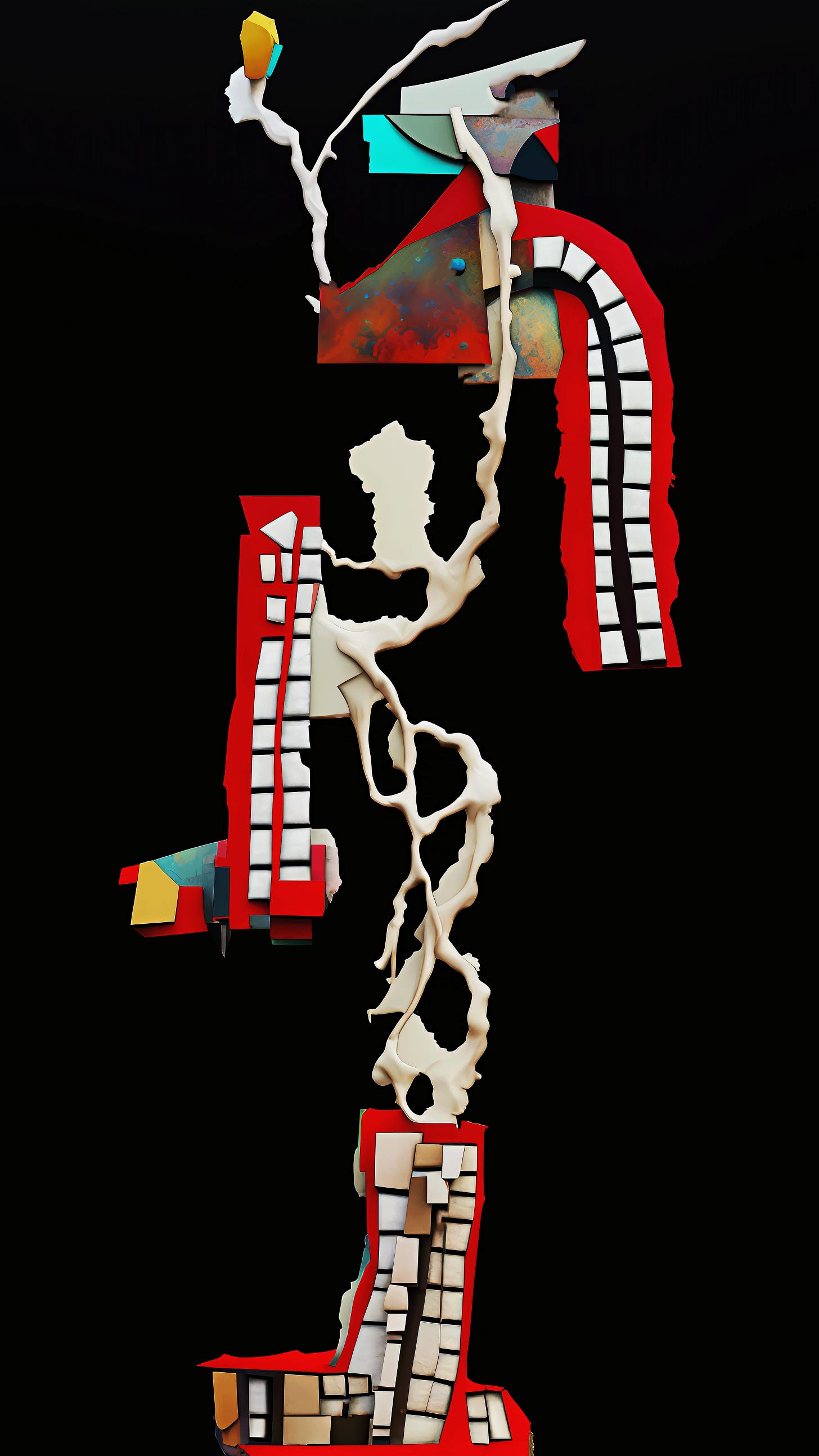
‘Form 05’ by Rez
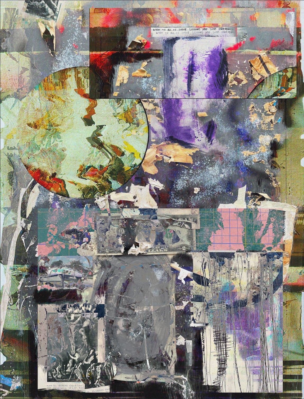
‘what if all of these lessons are just prophecies?’ by Ryab & Farid
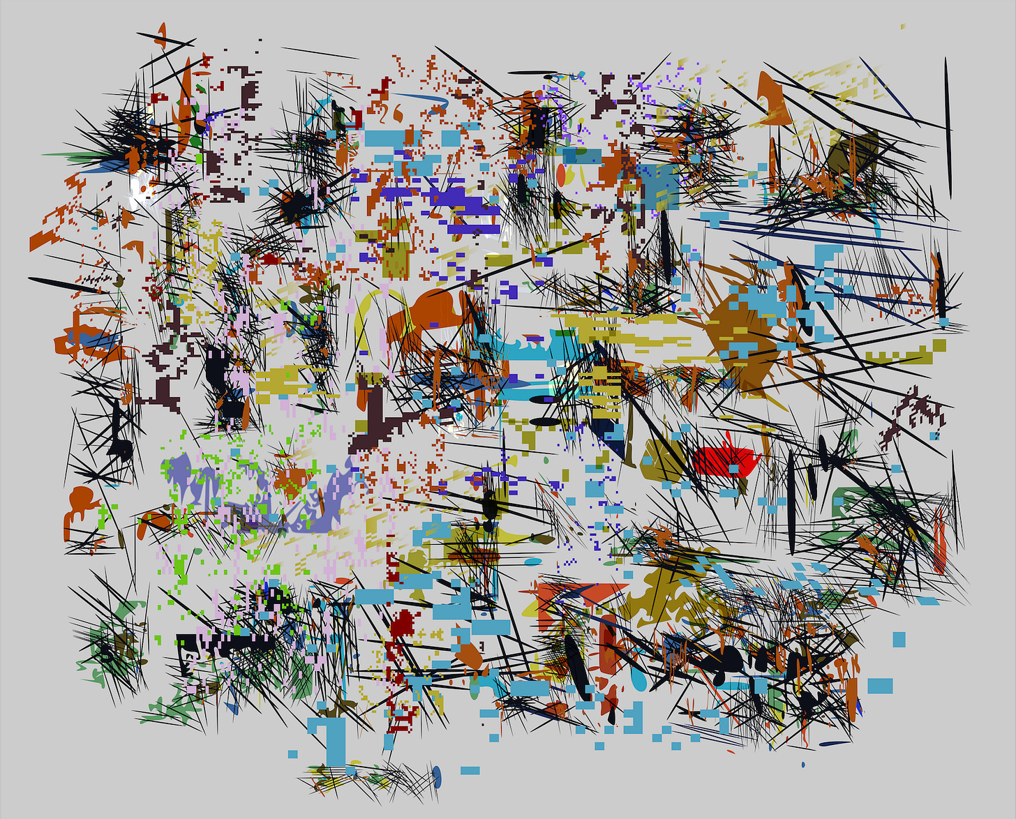
‘service of black magic door to door’ by Santiago
‘Inanition’ by Daniel Oropeza
‘Persepsi’ by yepstt & Luthfi Satya
At the end of each analysis you’ll find links to collect each work and follow the artists.
‘Form 05’ by Rez
First impression:
My first thought is that it feels like an organic structure that mixes the DNA of plant and human. The plant-like form makes the eye naturally travel from bottom to top. I like the choice of the solid black background. This doesn’t work for all pieces because it acts as a way of highlighting the colored elements, which must be interesting enough to be highlighted and there’s definitely no shortage of interesting material here.
It’s worth noting that this is from a collection titled ‘The Form of Thought’. It seems appropriate to assume that I’m seeing abstracted forms of common imagery one might see in their mind’s eye.
It is often not ideal, and sometimes even offensive, to attribute qualities of real-life imagery to abstract art. However, that’s not the case with all works and I’d consider this piece to be one of those exceptions. These three parts look like lips with teeth, which seems obvious at first glance. Something I noticed after spending more time with the piece is that the “teeth” seem to develop as they branch out further to the top of the structure. Notice how the bottom one is the most abstracted, messy, and seemingly in an early stage of growth from an origin of something brown, similar to how tree leaves begin. The middle one is cleaner and the top one is what we might call fully developed. Also, consider the number of these, 3, and their even placement. There is strength in having 3, rather than 2 or 4 here. The story is concise.
There are two simple yellow elements here that give the idea of flower buds. Again, just enough to keep the piece abstract while planting a story in your head.
I like the balance of these three blue areas. Balance almost seems to be their only purpose and it’s a nice touch. If you’re continuing with the idea of growth, it seems these might play a role in the early part of a new flower.
The connective stem of the structure looks like a mix of plant and bone material.
Collect or bid on the piece here.
Follow the artist here.
‘what if all of these lessons are just prophecies?’ by Ryab & Farid
First impression:
The element that caught my eye first was the sort of splotchy chaos of collage elements. At the same time, I was struck by the palette and powerful purple area near the top. There’s a bit of a claustrophobic effect that I get from this. It might have to do with how much different material is on one canvas and maybe also the way the paper collage parts are mostly covered with a paint-like element. The few white and lighter colored areas give a small sense of relief from that tension.
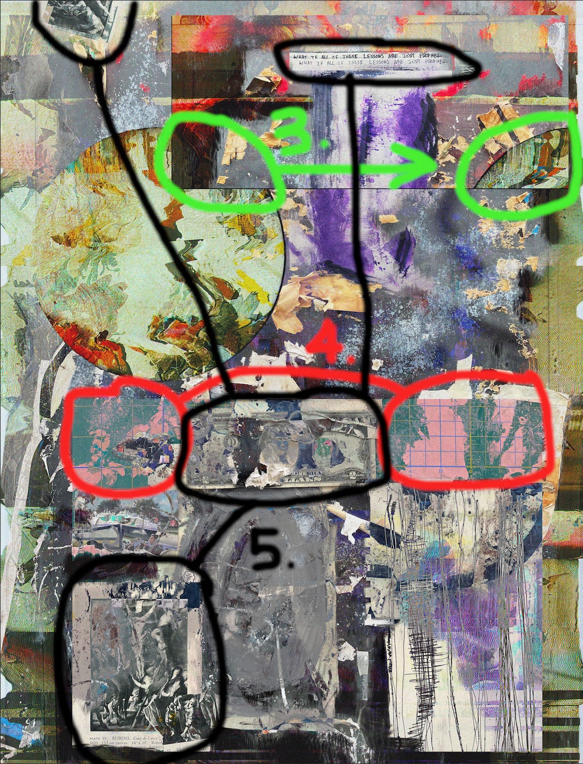
After my attention was initially drawn toward the top purple area, it naturally traveled downward to three other weighted areas as shown with the white arrow above.
There is a nice distribution of color for balance in multiple ways here. The three purple areas vary in size was a near-even separation.
The red, sort of flaky, areas fill in the space where the purple doesn’t touch. The hue and texture of the red vary but still act as one entity. It also provides some warmth to an otherwise fairly cool palette.
Also, notice the large area of black in the bottom area of the canvas that is balanced a bit at the top. Without marking all of them, you can notice several more examples of how color is strategically placed across the piece.
Though this piece uses collage, most of it blends together. I like that there are only a couple elements like this here where the piece itself is cropped. A meta-element that also acts as a signature across several of their pieces.
These two map-like pink areas have a strong presence right near the center. They stand out because they are one of the only things here that doesn’t have a balance of the same color anywhere else.
Finally, there are the black and white paper collage areas that, alone, cause my eye to move upward from the largest to smallest.
This work feels dense with meaning and more technique than I could point out here. Please feel free to comment the other things you’ve observed.
Collect or bid on the piece here.
Follow the artists here and here.
‘service of black magic door to door’ by Santiago
First impression:
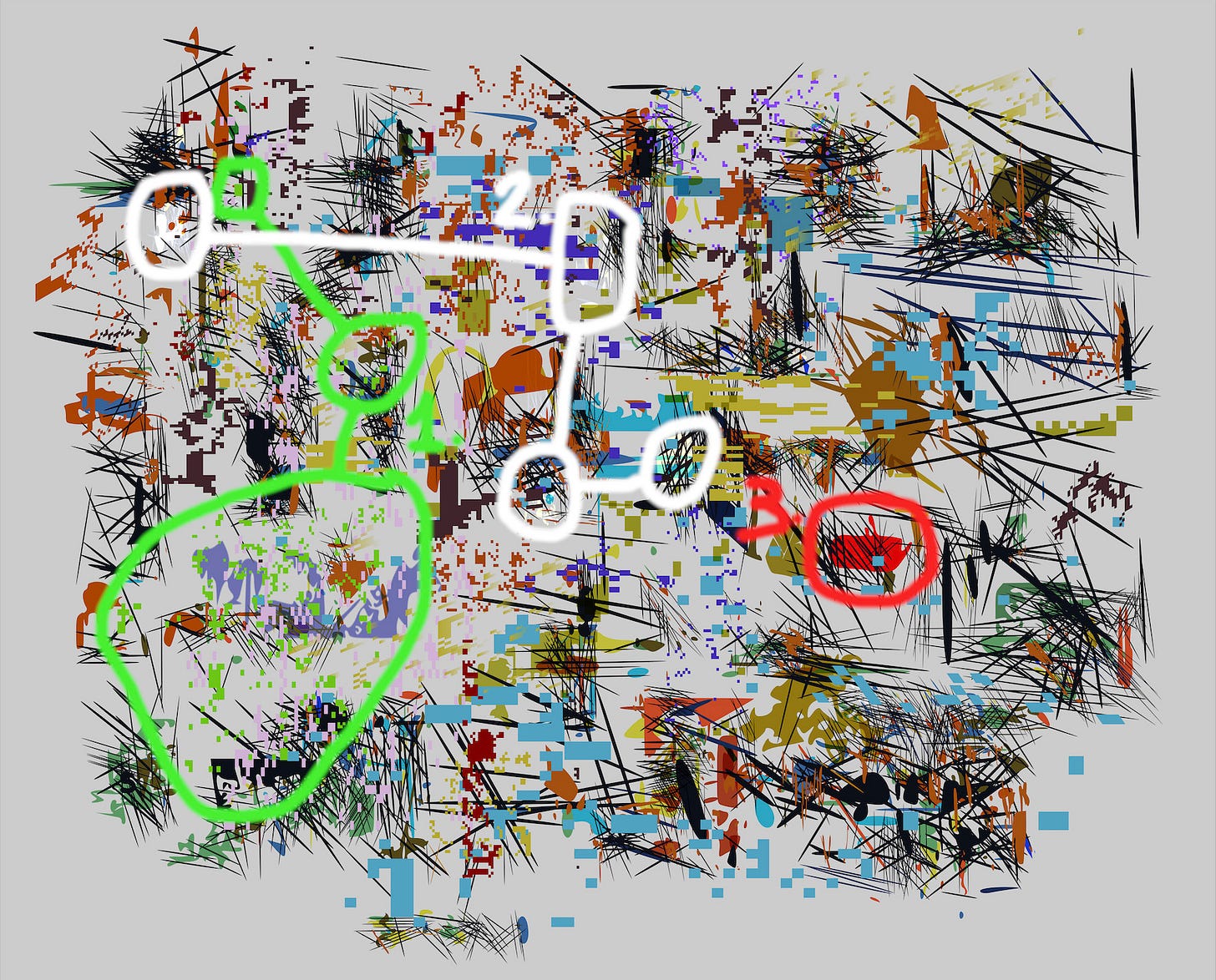
I love so many of Santiago’s pieces, but this one stood out as very different while maintaining his signature style, which is immediately recognizable in this one. Most of his recent works use warm colors and backgrounds with more red and yellow tones. This piece goes the opposite direction, using a colder grey background with blue over a large area. That being said, there is roughly an equal amount of a variety of reds that keep the balance. These hot and cold elements feel like the essence of the piece that allow the other colors to freely fill the rest of the space.
Something that struck me as pleasing is the consistency of materials across the whole canvas. There are no big holes or condensed areas that create imbalance. I typically like pieces that have more variety in this regard, but I’m not missing that here at all.
I was also immediately attracted to the clusters of thin black lines that give the piece a lot of noise and a violent juxtaposition to the more peaceful blocks of color.
Upon closer inspection, you find that a few colors seem a bit more rare and let us know this is not just a piece about the perfect balance of color.
The light green particles are only seen on the left third of the canvas with one large cluster and two smaller spots that get thinner the further away they are from the big area.
These white spots are particularly unique and contrast against the background and everything else the most. They are also roughly equal in size and shape, adding more to their significance.
This bright red shape is the only one of its kind, making it possibly the rarest element in the piece. However, it is still subtle enough to not steal attention from the rest of the piece.
Collect or bid on the piece here.
Follow the artist here.
‘Inanition’ by Daniel Oropeza
First impression:
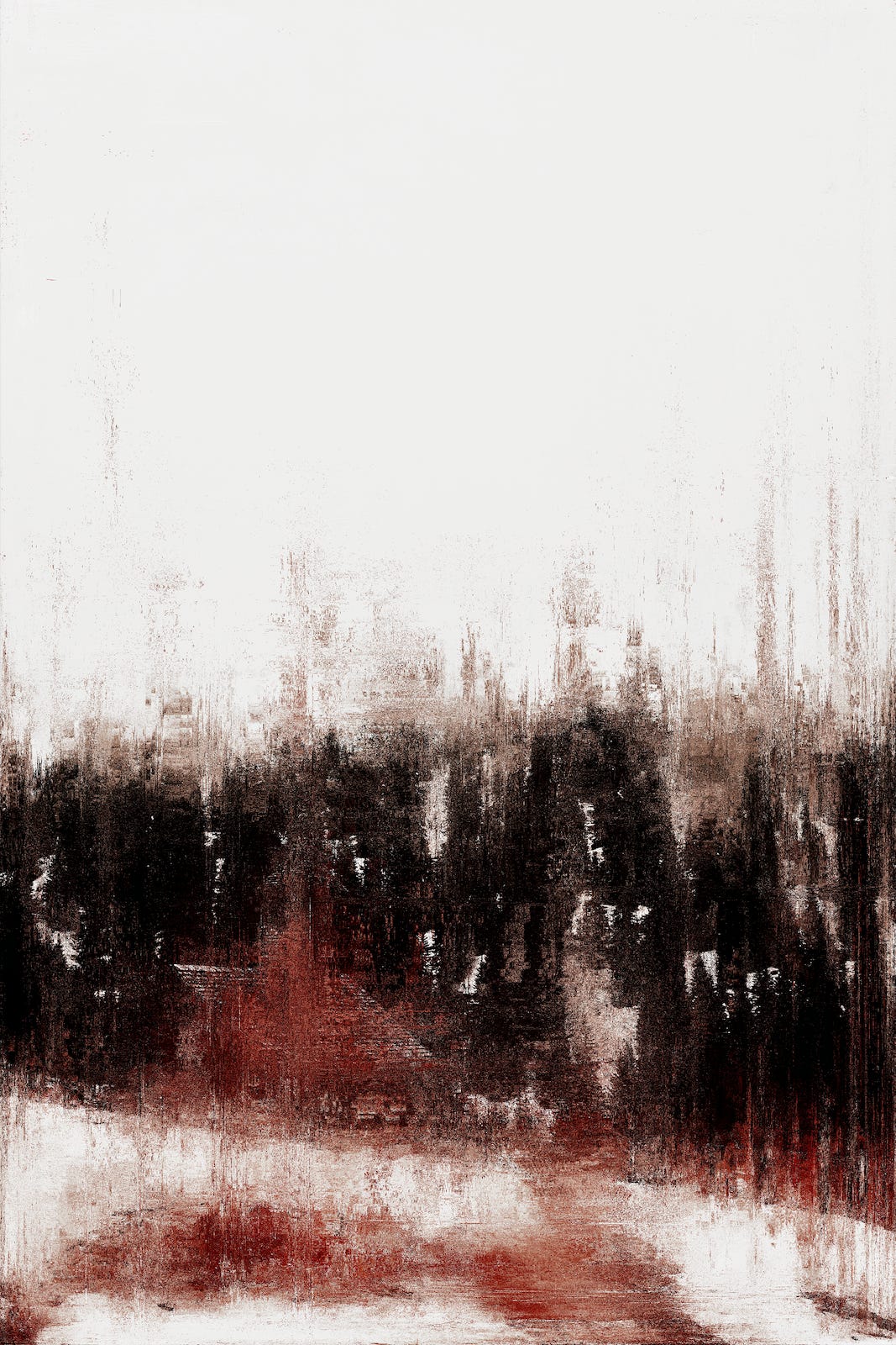
The texture is big for me here. I feel like this texturing would make any color combo look really good. I love the dark-themed colors (somewhat in line with the title) that give me the impression of blood smeared on pavement against a large open off-white background. The shear size of the dark area has an undeniable weight and physicality. This weight is accentuated further by its position in the bottom half of the canvas, adding a sense of gravity.
Though the large dark area has a lot of weight, there is still an instability to it that contributes to the movement of the piece. It lies in the bottom line marked here. If it was a perfectly horizontal line, the piece would have a more static feel to it, but this diagonal creates enough weakness to give it some action.
This spot is very interesting to me in that almost seems out of place but doesn’t call too much attention to itself. I like it because it doesn’t take anything away from the piece, but makes me question what is going on there.
These streaks create a lot of movement, again, adding to the gravity of the bottom half of the canvas. I also like the blend of black and red here and in other areas that give the piece some depth and earthiness.
[unmarked] Lastly and importantly, I am blown away that this piece was created purely from code. It really looks like paint or another real substance, but when you zoom in, you can see that it’s made up of tons of tiny glitched pixels.
Collect or bid on the piece here.
Follow the artist here.
‘Persepsi’ by yepstt & Luthfi Satya
First impression:
I was initially grabbed by the loud, sort of dirty-textured, yellow and orange, and their contrast with the large grey area. The piece has an overall urban vibe that is mostly accomplished by the stained concrete effect. This is different from the Daniel Oropeza piece in that it has many perfectly horizontal lines that give it a more static feel. Yet, it is not lacking in movement. The large circles that are made of small evenly-spaced squares feel like they are actually turning. It’s hard to tell if this is simply due to the contrast against the still boxes or if it’s the way they’re constructed with concentric circles growing larger from inside to outside. The variety in color and shade of the individual squares may help with the sense of movement.
There are a few elements that tie the large yellow and grey blocks together in a yin-yang sort of way. The two orange parts are the most obvious. The subtlety here is in the sizes of the each one. Thinner on the yellow since the yellow takes up less area and larger on the grey. On closer look, the top one is actually red but still draws the eye to the larger orange piece because the yellow makes it feel closer to orange. I love these types of illusions.
These two sets of three blocks are a clear motive that loosely relate with the larger orange block. They are also one of the elements that helps tie the yellow and grey areas together and one set sits across both.
These three ~equally sized circles that are reminiscent of spray paint, add a little counterpoint to the straight lines and help center the piece with their locations.
These X’s are an interesting one-off element that almost doesn’t seem to fit, but is just another detail that adds interest and contrast to that large area of horizontal lines.
The polka-dots add to all the other circular elements and are placed as another functional player in tying the yellow and grey areas together.
The purple/blue thin lines add a coolness to mostly warmer colors. The vertical ones add a some variety to the almost exclusively horizontal rectangles.
There seems to be a bit of collage here and complexity in the way parts are blended and juxtaposed. At the same time, this piece is mostly built out of two simple shapes, rectangles and circles. There are no diagonals that hint at the use of triangles.
Collect or bid on the piece here.
Follow the artists here and here.
I absolutely love spending time with art in this way, dissecting it for better understanding and extracting maximum enjoyment out of each work. It’s even more fun when I get to share my discoveries with you. I am by no means an expert in this area, but I’m learning more each day. I’m also very experienced in an adjacent area that helps inform my perspective on visual abstract art. Get a better understanding of where I’m coming from in the intro post:
Further Reading
As I continue learning how to observe all there is see in each piece, I would love it if you commented or DMed with any helpful books, links, articles, etc., that you think would be beneficial or interesting.
A couple books I’ve found helpful so far are, of course, the classics by Wassily Kandinsky. For those of you who are unfamiliar, Kandinsky is considered one of the main pioneers of abstraction in the western art world. These two books are small, easy reads, but highly informational and impactful for anybody wanting to learn about the philosophy and techniques of this form of art:
‘Point and Line to Plane’ and ‘Concerning the Spiritual in Art’ by Wassily Kandinsky
That’s a wrap for this week!
If you love abstract art and would like to learn more, go ahead and subscribe for free.
This is only the beginning of what will be an increasingly informative publication that will benefit artists, collectors, and all who enjoy abstraction in art and music.
If you want to help others discover the wonders of this mysterious form of art and support my research, a share goes a long way.
Thank you so much for reading and have a great week!


