


Abstract Art Analysis 3
Seeing beyond the surface and challenging our notion of beauty.

Welcome to week 3 of AAA! I hope you enjoy these works as much as I do and that you’re able to take away some valuable insights into looking deeper at abstract art.
Content:
This week’s pieces:
‘who needs dirt’ by Clint Fulkerson
‘Artist leaving the space, no one went Guernica about it’ by Evelyn O.
‘022023’ by ADHD/Space Case
‘Chains Of Cause’ by Ciput
Bonus: Discover accounts to follow and a piece by one of my favorite composers.
You’ll find links to the artist and the piece at the bottom of each analysis. Enjoy!
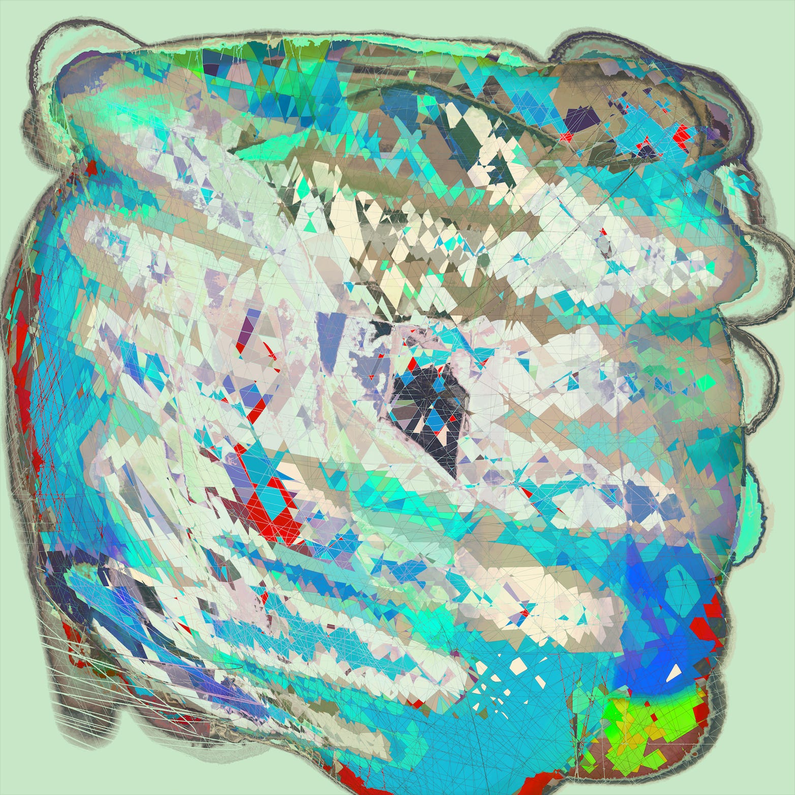
‘who needs dirt’ by Clint Fulkerson
First impression:
I feel the need to start by saying that this is one of my favorite pieces I’ve experienced and collected in a while.
The thing that caught my attention was actually the initial ugliness of it. I wasn’t sure if I liked it at first, but for some reason, I couldn’t stop looking at it. This might be a sign of a great piece of art.
The color and texture combinations were confusing to me but refreshing. Also, the choice to cut off part of the work at the bottom and the right side of the canvas bothered me at first (why don’t I get to see the whole thing?). I wasn’t sure if I loved the piece or not. When I have reactions like this, I do my best to accept the challenge of trying to understand why I feel this way. I’m glad I did because it brought me to the realization that this is a specific characteristic of digital art, particularly works that are produced with the assistance of AI or generative systems. There’s a certain purity in allowing these “imperfections” in the final product and they reveal some insight about the mediums used. It may actually be okay to accept this type of thing as a general signature of the aesthetic of a new era. It’s just another detail that helps punctuate this period in the historical timeline.
It’s too easy to immediately reject something new that doesn’t fit neatly within our established boundaries of how things should be. It is the job of art and music to get bored with the norm and challenge our understanding of “good” and “beautiful” with new techniques. Even the most pleasant and safest pieces of art throughout history were, in their time, controversial (not to say this piece is controversial), and gradually accepted as beautiful by a large portion of the world. Clint’s expression below the title of the piece, “growth can occur in harsh environments”, is very fitting in this context. The term, baroque, comes to mind. I may have to do a deeper dive on this later.
I eventually found out that this piece is inspired by the growth of plants on rocks, which made so much more sense. The concept brought me back down to earth, but the lesson from my raw impression will have a profound lasting effect on my taste and perception.
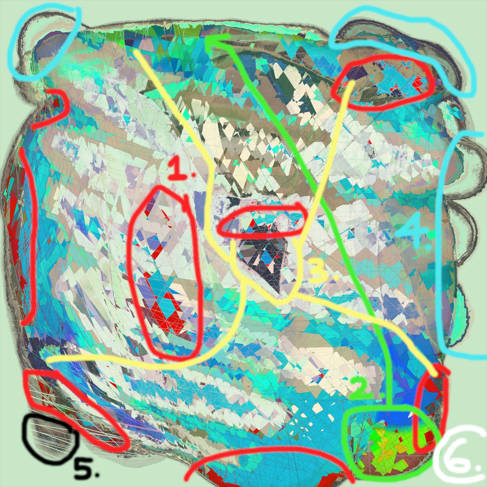
These red areas are the first to catch my eye, adding a brilliant gem-like element to a palette that is dominated by blues and greens. I like how various shades are used. The brighter reds are near the center and darker around the edges. I only marked larger areas, but I also like how there are specs of this red throughout the piece.
This bright green is an obvious focal point as it’s the only spot with that intense color, which also includes the yellows that aren’t anywhere else. The greens in the top of the piece are not exactly the same but are related enough that the eye connects them, adding a sense of balance. Different shades also give more complexity and dimension. This is the case with all of the colors. The overall light composition is fun to explore here.
This is one of the darkest areas, which, along with the red, assist in giving the piece an overall focus toward the center. You see related pieces of this near each corner of the canvas, strengthening the case for balance and centrality.
These outer areas are related to the texture of the entire perimeter of the structure, but these specific parts also act as focal points that stand alone as their own element. It’s these textures and their colors that were difficult to understand for me at first and I still have no idea how they are achieved. They act as a nice counterpoint to the jagged, smooth-surfaced, colorful areas.
The white lines in this spot are another focal point as it is different from any other area. It also gives a bit of insight into how the jagged colored pieces are created. It seems like the first layer of the piece might be these darker browns, then a bunch of random lines are laid over it to slice it up, then the resulting spaces are filled with colors. What’s interesting, though, is that the outer areas pointed out in point ‘4’ don’t have these lines. Yet another question that keeps this piece mysterious and exciting to me.
The sea green background is a peaceful color and easy on the eye. It gives the impression that the “rock” might be near water.
Collect or bid on the piece here.
Follow the artist here.
‘Artist leaving the space, no one went Guernica about it’ by Evelyn O.
First impression:
There are two parts of this that made me stop and look. Well, three—the first being that this was done by Evelyn, which means I must stop and look. After that, it was the large area of powerful purples and the fact that it had “Guernica” in the title. Then I realized this is very much inspired by Picasso’s famous work (below). Picasso painted it as a response to the bombing of the town, Guernica, in his homeland of Spain by the Nazis.
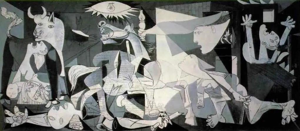
Evelyn’s title might suggest a war on the current NFT art space (my interpretation, of course) and that nobody has created a piece as a response in protest. I’d love to know if this is even close to what the artist intended.
I appreciate how the piece is obviously inspired by Picasso’s, but maintains the freedom of a standalone signature Evelyn work. That being said, let’s point out a few elements that were reinterpreted after the original.
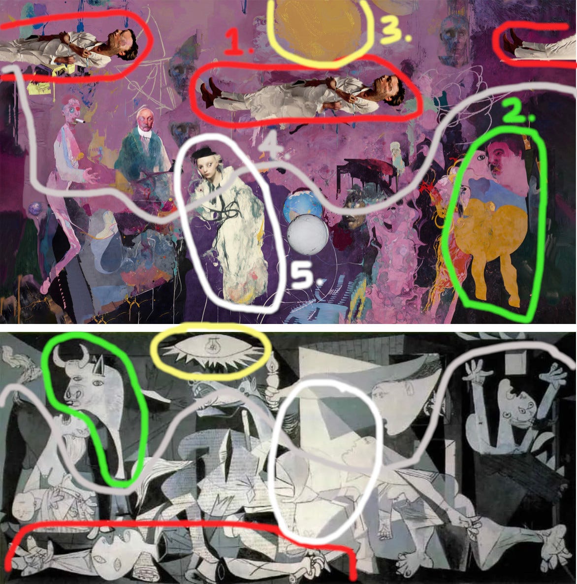
[unmarked] The first overarching element you notice is the monochrome effect. Picasso’s is black and white, Evelyn’s is purple (not truly monochrome, but in effect).
You have the horizontal body of someone we can assume is dead. This is at the bottom of the original with the head to the left. This idea has been redesigned to be near the top of the canvas and in the opposite direction.
There’s the bull, reinterpreted on the opposite side of the canvas and with a human head. There’s a subtlety in the way the eyes are treated in relation as well.
The light bulb is redone as a yellow circle that could be seen as the sun.
The bottom half of Evelyn’s piece uses darker purples that are consistent with the darkest areas on the other.
This is the brightest white area on the Picasso, slightly right of the center. Evelyn has added this detail as the brightest area of the piece slightly left of the center.
There are many other similarities I could point out here and keep finding more of them the longer I stare at the piece. All of this comparison is not to take away from the extra detail Evelyn has added to the work, so I’d suggest going back and enjoying it on it’s own.
Collect or bid on the piece here.
Follow the artist here.
‘022023’ by ADHD/Space Case
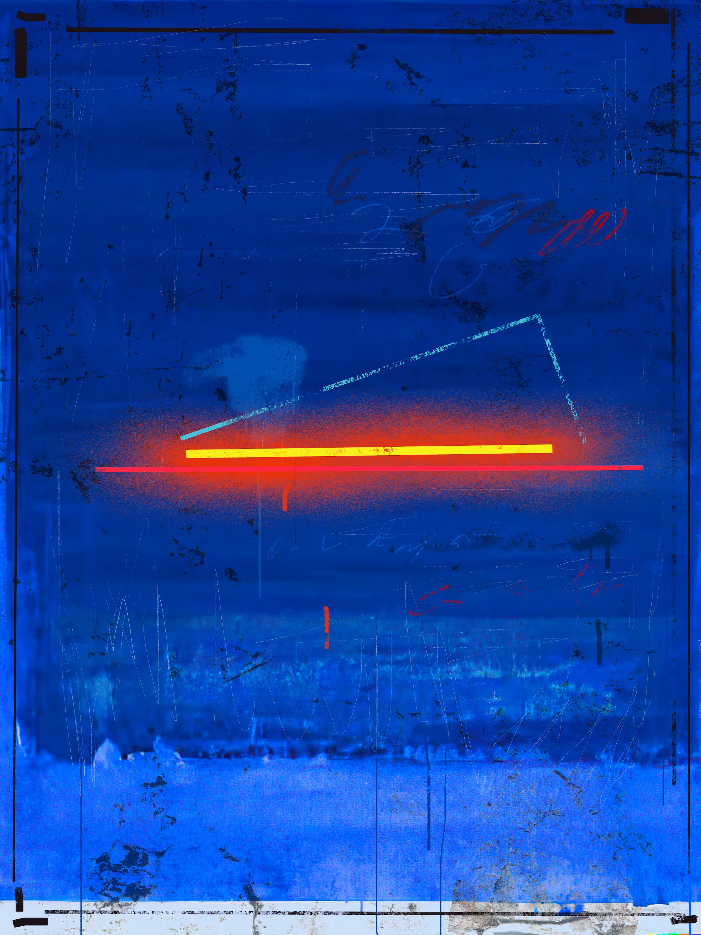
First impression:
This color and lighting made it very easy for me to stop and stare for a while. The mix of vibrant blues and reds together always catch the eye. Then you have the bright yellow cutting through the center that pulls you in and doesn’t let go.
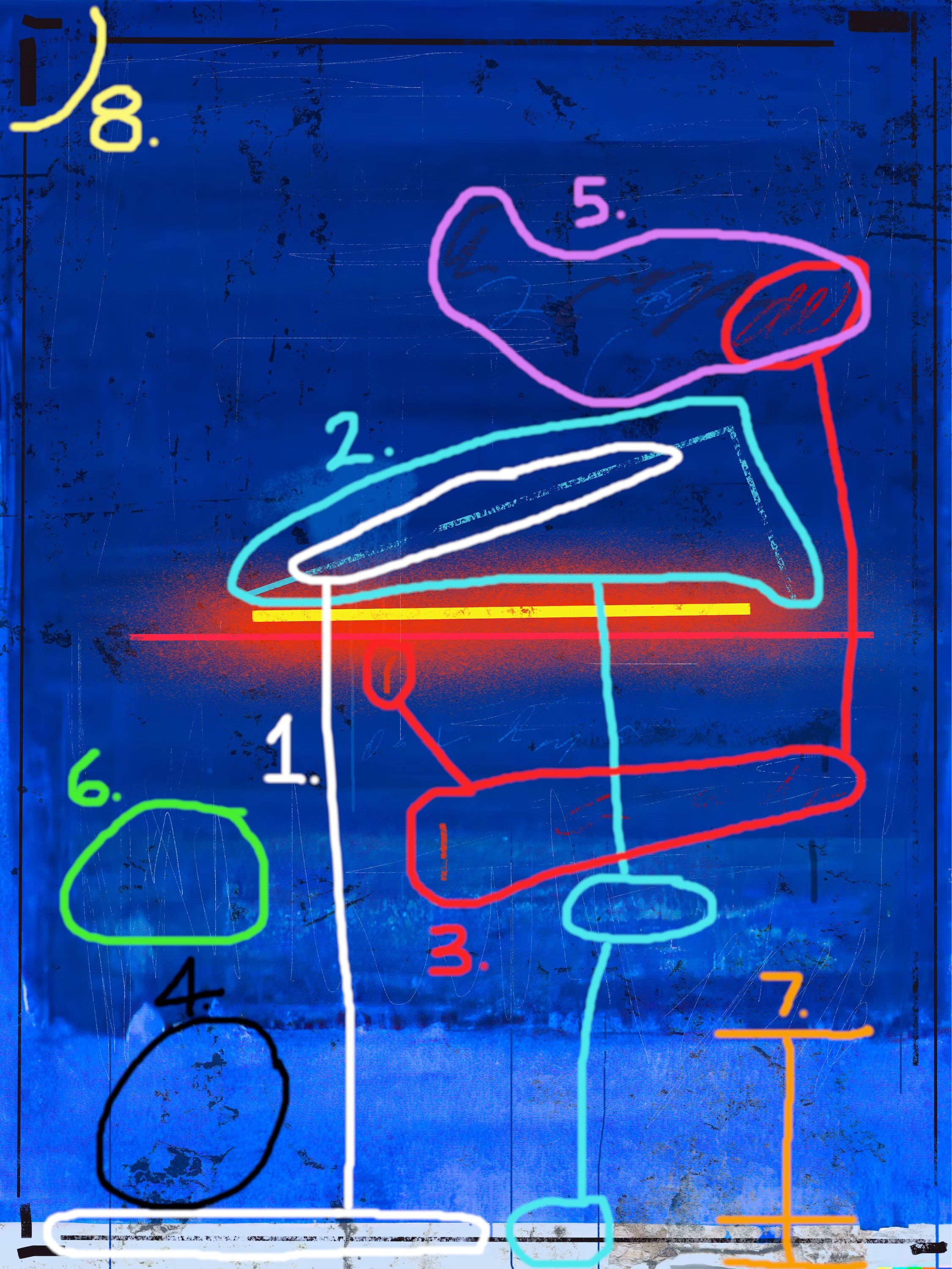
The obvious focus here is the material at the center of the piece. The light composition is explosive, yet tight, which is achieved by the hard yellow line over the red spray-paint particle texture. This is emphasized by the wider palette of deep blues. The three hard lines here play as a strong melodic triad in counterpoint to the rest of the materials that are soft, rounded, and less bold in stance.
The only other area these types of lines exist are at the edges, creating a sort of frame around the piece. The worn look on this bottom one, revealed by the bottom layer of paint, confirms the relation.
The light blue angled line sits in the darkest area of the piece, creating balance in the top half with the lighter areas at the bottom.
These red curvy lines add a nice accent around the center lines and their specific texture softly bridges the gap between the straight lines and the other types of squiggly lines marked in point ‘5’. The worn texture and thickness of the red ones achieve this.
These black splotches are scattered through the canvas for a more interesting texture.
Some of the other types and hues of squiggly lines that float around the main central shapes in contrast.
Another type of the lines mentioned in ‘5’ but with their own character as thin and scratchy. They add a bit of light throughout the darkness of the work.
Here you can see that there are three main layers of paint. I like the use of this technique as a texture itself and a way to reveal other details that are underneath the thicker parts.
The corners have these short randomized lines that add contrast to the longer straight lines in the border structure.
Collect or bid on the piece here.
Follow the artist here.
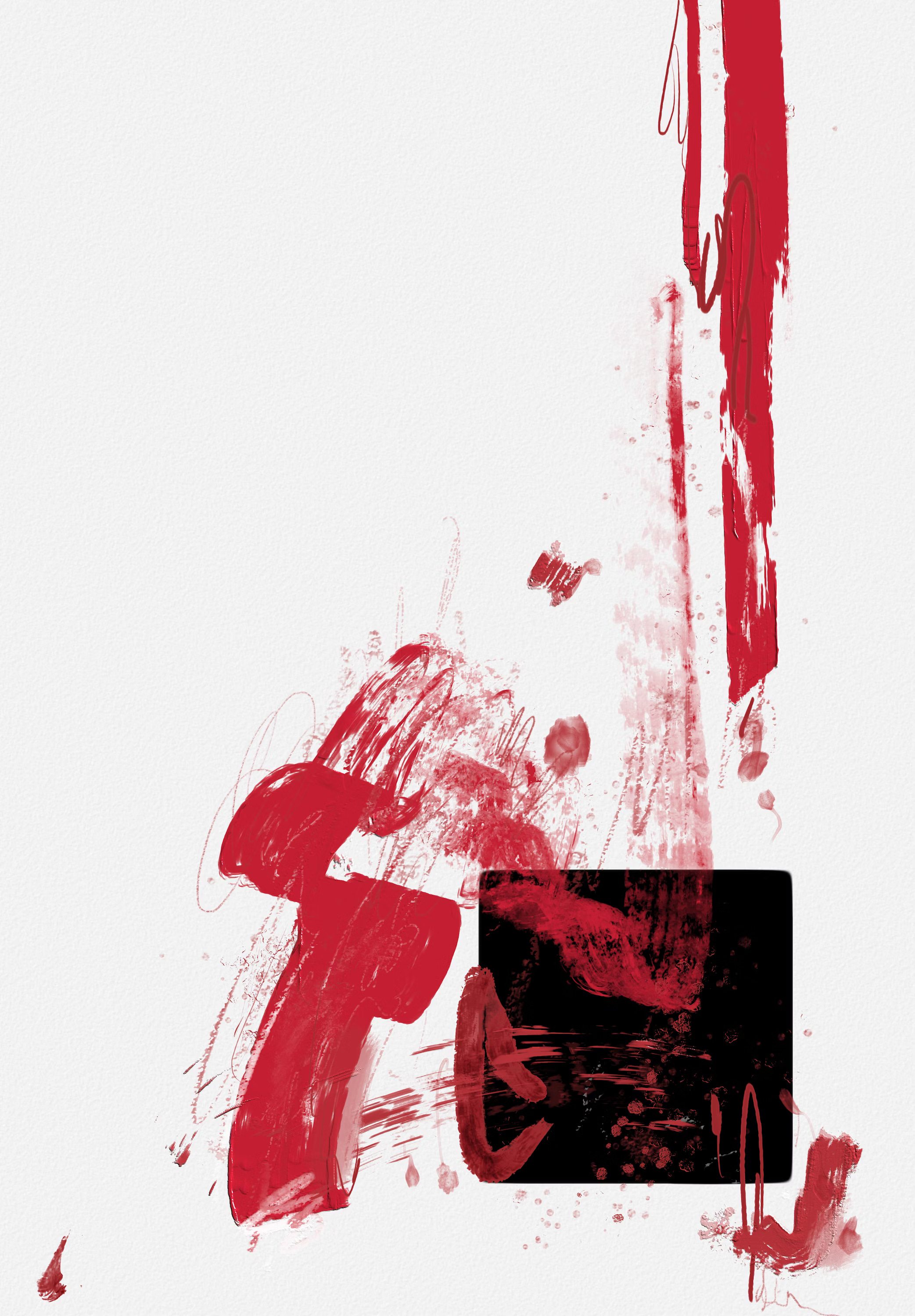
‘Chains Of Cause’ by Ciput
First impression:
I immediately fell in love with the overall simplicity and free flow of the red strokes against a large open space.
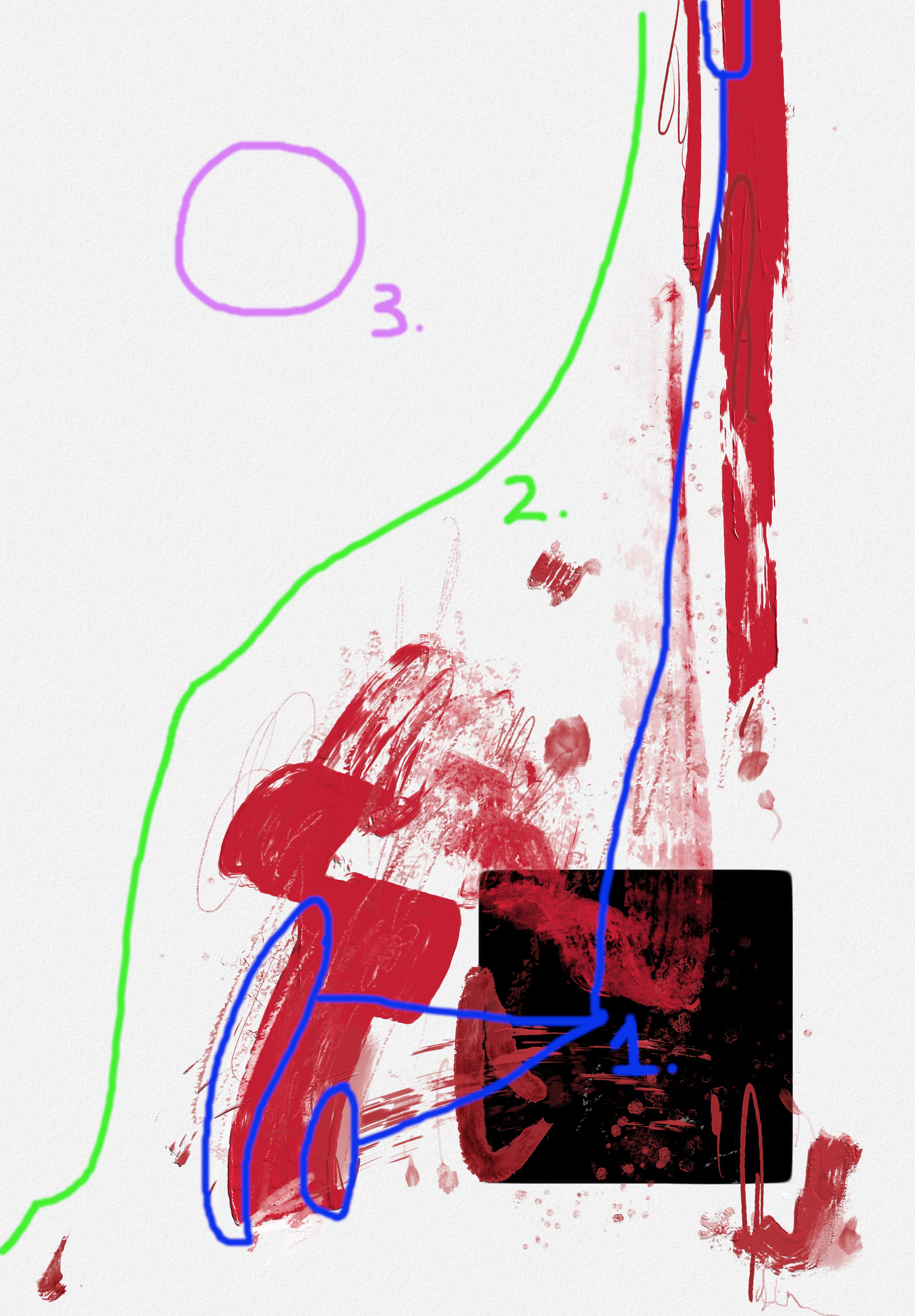
This is a simple counterpoint of two elements. The black square holds the piece down as a weighted base that allows the red paint to move freely and chaotically. Each would be boring on their own, but together they create a dialog, as well as a third dimension. The off-white canvas gives the whole piece a calmness. It would be much louder and sharper if this was pure white.
There are these tiny black outlines in some of the red areas that are just present enough to help trace extended areas back to the black square.
All of the activity is weighted to the left and bottom of the canvas. A minimalism and departure from centrality that I love.
If you zoom in to the white background, you can see that it is textured with little 3D bumps. These add to the softness effect.
Collect or bid on the piece here.
Follow the artist here.
Extras
Here are a couple accounts follow on Twitter/X and elsewhere:
Pixel Symphony is a generative artist who is educated in modern art history. He posts his art and easily digestible, informative, highlights on historical figures in modern art. He’s also just a very positive and supportive person and who doesn’t need more of that on their timeline?
The Cultural Tutor is an incredibly impressive account that posts long, high quality, threads on the history of art, music, architecture, and more. They also have newsletter that goes deeper into the topics they post about on Twitter/X.
Music
If you’re interested in contemporary classical music that is basically the sound equivalent of abstract art, check out this piece by one of my favorite composers, Michael Hersch. This is a piano piece performed by the composer himself. It’s dark and violent, yet beautiful and delicate. This piece use textural stratification, which is the juxtaposition of two different textures. I think you’ll see what that means when you listen.
That’s all for this week! If you’d like to learn more about my perspective and background, check out the “Welcome” post:

Thank you for reading and have an amazing week!
-LW