
Abstract Art Analysis 21: All That Glitters Is Glitch
Three carefully crafted glitch GIFs.

Welcome to AAA 21!
This week, we dive into three radically different animated glitch pieces that each demonstrate a high level of control and design within a method of art-making that is inherently chaotic. I hope you get as much out of this one as I did. I can almost guarantee you’ll discover at least one new piece that you haven’t seen before.
Enjoy!
Content:
Art:
‘Composition 126’ by klaus
‘M-T1037/N’ by Samei
‘SAW HER VOICE IN MY DREAMS’ by digitaldash
Other Cool Things: An otherworldly new work by Miles Peyton, an audio-visual piece by hi_im_adam, and some realness about the generative art market by Haiver.
‘Composition 126’ by klaus
I was excited to have this piece on the list for this week, but then I hesitated to go through with it when saw Adrian Pocobelli cover it on his Artist Journal 297. After some thought, I concluded that work very much deserves the overlap of our unique perspectives.
I’ve been a long-time follower of klaus’s work, collecting a few pieces along his journey, and have admired the evolution of his voice over time. With the start of this new series of works titled ‘Composition’, the artist seems to have accelerated his rate of output with an impressive 137 iterations so far in only two months. What’s more impressive is that the quality, the elegence, and complexity of his output have reached new heights during this period as well.
I think Pocobelli and I both agree that there’s something special about this particular piece in the collection. Though all of klaus’s outputs cause me to stop and admire for a while when I see the objkt notification or catch it on the 𝕏 timeline (a major compliment in “scroll culture”), this one hit me on another level.
I may not be able to describe all of the details that elevate ‘Composition 126’ to a new realm, but there are a few obvious elements to point out, some of which are contained within the piece and others that are perceived as being absent when considering the context of the collection thus far.
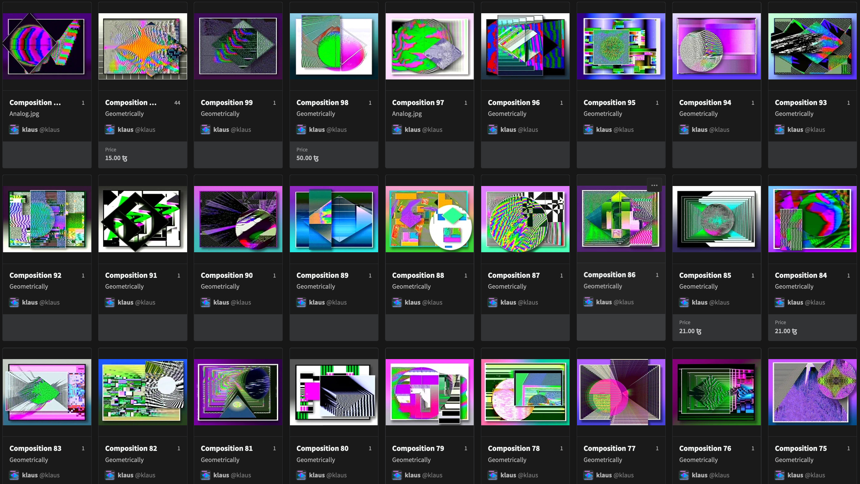
The above image is a handful of examples from the collection that are representative of the overall style and feel (if this is too small, visit the collection page).
At first glance, you’ll notice two things:
Color palette: the colors used in most pieces throughout the collection are vibrant, almost psychedelic, with a lot of bright pinks, rich purples, greens, and multiple colors in almost every piece.
In contrast, ‘126’ uses a minimal color palette and though the purple is still present, it is very muted compared much of the collection.
A rare golden yellow hue is used as well, covering a large area as the main focal point.
Shapes: this piece fits in perfectly with its use of layered squares and rectangles, but differentiates itself in its lack of circles and clearly defined diamonds. If this piece wasn’t so pleasing, you might guess that the artist forgot to add one of those shapes over the top. This being said, we get what appears to be a zoomed-in, and slightly abstracted, version of the diamond shape in the upper half of the piece.
The golden yellow, and the way it animates, adds a lot to the perceived elegance of the work. Though fairly muted, the color feels closer to a shimmering gold as accentuated by a black background and the way it glitters as it trickles down the canvas. Add the purple and you have two powerful colors that represent class and regality.
There is a interesting phenomenon that occurs all too often in the life of a creative. You have a piece that feels unfinished or unsatisfactory within the confines of your current perspective, or perhaps its one that took the least amount of effort, and it’s that piece that garners the most attention and traction. The success of this piece seems to be a result of this phenomenon as described by klaus himself, presenting the valuable lesson of getting out of your own way.

Let’s now take a look at some of the finer details of the work:
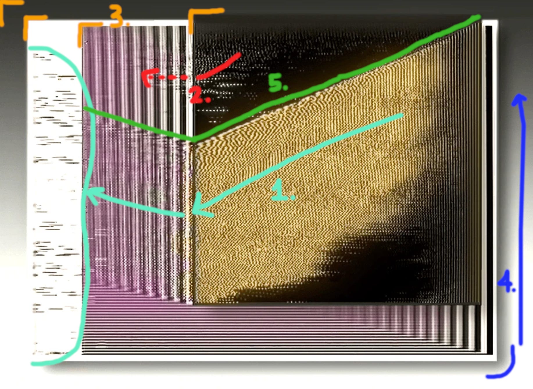
The piece has a generally central focus with your attention initially captured by the gold area. From there, your eye is guided with the downward slope and flow of the animated particles to the left, pausing at the vertical black and white lines, then resting on the jittery black fragments over the white edge.
There’s an interest effect here where the particles move smoothly in the black area, then sort of break up and comb through the vertical lines.
We have a hierarchy consisting of five clearly separated layers of what I’ll call “windows”. To blend and connect the layers, you have the “particles” travelling over all except for the bottom, separating that layer even further as a sort of base and frame for the rest. I didn’t mark it, but if you look at the bottom left corner of the top gold and black window, you’ll see that there is a dragged effect, like multiple copys of that window layered beneath. There’s a play on dimension in the way the effect is cut off at the top of the purple layer.
The shadow at the bottom and right give a sense that this layer is floating above the base layer. It also adds balance to the top half in a opposite, yin-yang, sort of way.
This is the abstracted diamond shape mentioned in the writing above. A gesture that I think could be abstracted further as the collection progresses.
‘M-T1037/N’ by Samei
First impression:
Upon first look, I was quickly attracted to the GIF style of small transitions of color to neighboring squares that almost gives the energy of twinkling stars, but more jittery. The activity as a whole has a relaxing quality. I inititally thought the animation was maybe one second long, with very simple alternating colors.
After giving the piece more of my attention, I realized the GIF lasts for several seconds with a larger transition that happens at a slower rhythm. You’ll see that much of the white portions change to yellow. I really appreciate Samei’s attention in creating more than one layer of rhythm within a relatively short amount of time.
There is also another form of layering in the use of pixels. The first thing you notice when you see this piece are the colored boxes that seem like large pixels on the surface. You can track these boxes throughout the entire canvas and see that they act as a consistent grid throughout that contain various patterns of actual pixels that are much smaller.
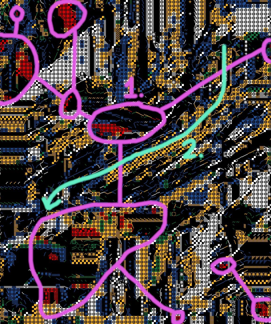
The distribution of reds guide you from top left to bottom right of the canvas. A nice pop of warmth and added interest.
The main flow path goes right through the center starting from the upper right and moving down to the bottom left. This is offset and balanced by the general path of the red pieces.
[unmarked] Lastly, I want to note the amount of black open space throughout the work. A sense sense of breath in the cracks that also adds depth.
‘SAW HER VOICE IN MY DREAMS’ by digitaldash
I want to briefly highlight a piece by a new account I recently discovered from a retweet of one of my good friends and a favorite artists in the space, Ryan Staley. It’s an alt-account of a mysterious artist who’s main account I’ll keep to myself until they give the word. They have only released two pieces on their 𝕏 profile so far that I don’t believe have been minted for sale on a platform yet, but I imagine they will begin doing so at some point.
When I stumbled up on their posts, I was quickly attracted to their style of glitch. This has a faster tempo to it and the best way I can describe the rhythm is snappy and groovy. It has a ‘S’-shaped movement to it, almost like a whip cracking in slow motion, or maybe remiscent of a bellydancer.
I appreciate the multiple layers and textures used. You have various squares/rectangles on one plain containing their own moving parts, then you have a smokey white element whipping back and forth over the top.
Something I found really fun and surprising was the fact that I didn’t see the words on the edges at all for the first few seconds as my eye was fixated on the center, then after a while, they seemed to appear out of nowhere. I don’t know if this will be the same experience for everybody, but it was a source of genuine excitement when I realized they had been there the entire time.
I’m excited to see what happens with this account.
Other Cool Stuff
Miles Peyton’s newest release, ‘harpfeeder’, is incredibly fascinating, impressive, and in a world of its own. It’s a dynamic and interactive artwork playing of “living” organisms that resemble a harp-like sea floor plant thing at which you can shoot jelly-fish-like blobs to see how they stick and interact. Read about it here and go play with it. Here’s also a video example:
hi_im_adam release a cool new audio-visual work, ‘Excitotoxicity_01’, presenting appropriate social commentary of our modern lives.
Haiver wrote a killer article on the fact that great generative art still sells and the importance of quality and awareness of the market you are participating in.
Thank you for reading!
Feel free to leave some feedback or other observations in the comments and please give it a ❤️ if you enjoyed it. Also, consider restacking♻️. These are very small gestures that goes a long way🙏
Be sure to check out previous editions of Abstract Art Analysis, as well as Artist Spotlight and 𝕏 Posts & Education.
Have an great week!
-LW❤️🔥